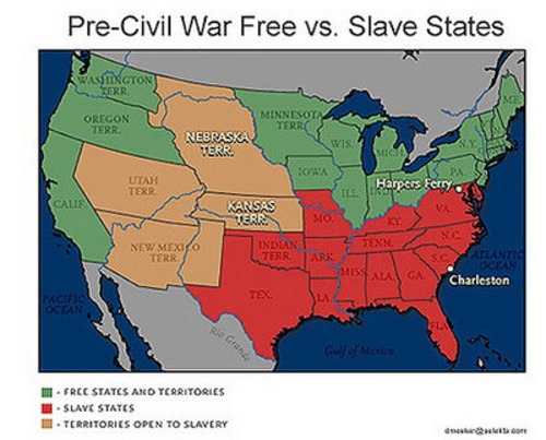
Focus on the red and the beige ....

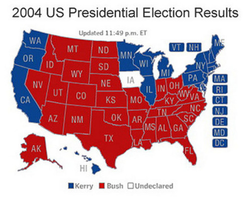
... and compare them with this.
Well, this is interesting (in fact, very interesting) but it is no more conclusive than the red county maps the Bush people are flogging. A more accurate assessment is a map showing relative percentages of votes per county and state -- a Purple America.
Tom Englehardt of Tomdispatch has some fun with maps in his most recent post:
As soon as you consider the vote county by county, the look of the red/blue configurations begins to change dramatically -- even more so, if counties are essentially not awarded in toto to either candidate. Then you end up with a "purple America" map that begins to take into account the Bush voters in New York City andthe Kerry voters in deepest Texas. If you're really curious, scroll down two maps and try your luck at matching the purple electoral map against a dark-sky snapshot of electricity-use nationwide or simply check out a basic red-and-blue map rescaled for population (scroll down).
The population cartograms are marvellously weird - almost psychedelic!!